Players are still unhappy that Arthur from the Red Dead Redemption 2 artwork doesn't resemble his in-game version

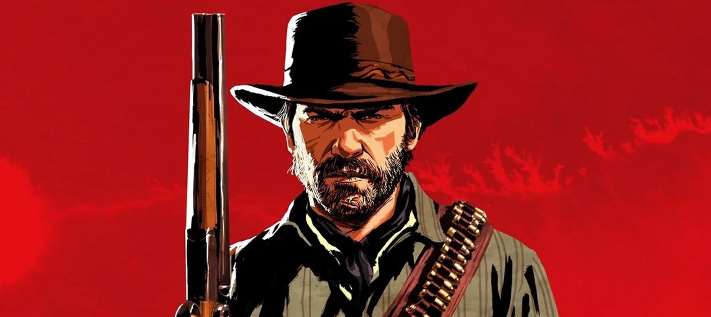
The cover art for a big game is almost always drawn while the game itself is still unfinished.
Artists get their hands on intermediate models, marketing designers get a deadline, and years later players squint at the poster and realize the person on it simply doesn't exist in the game.
That's exactly the issue that's followed Red Dead Redemption 2 for years. Dutch, Sadie, Micah, and John are instantly recognizable in the official artwork, but Arthur Morgan looks like he wandered in from a completely different western: harsher, more angular face, lighter hair, clothes that don't match any starting outfit.
The difference is noticeable enough that some players spent years convinced the key art didn't depict Arthur at all.
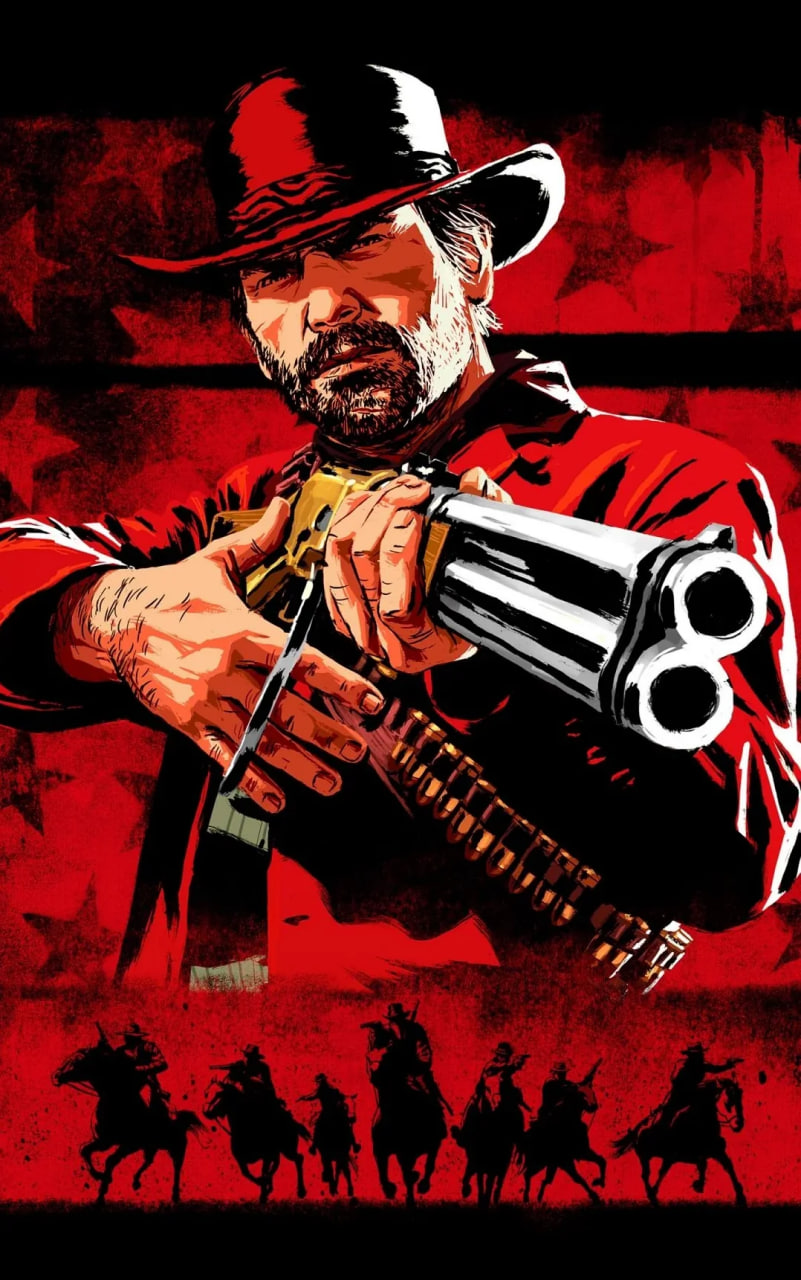
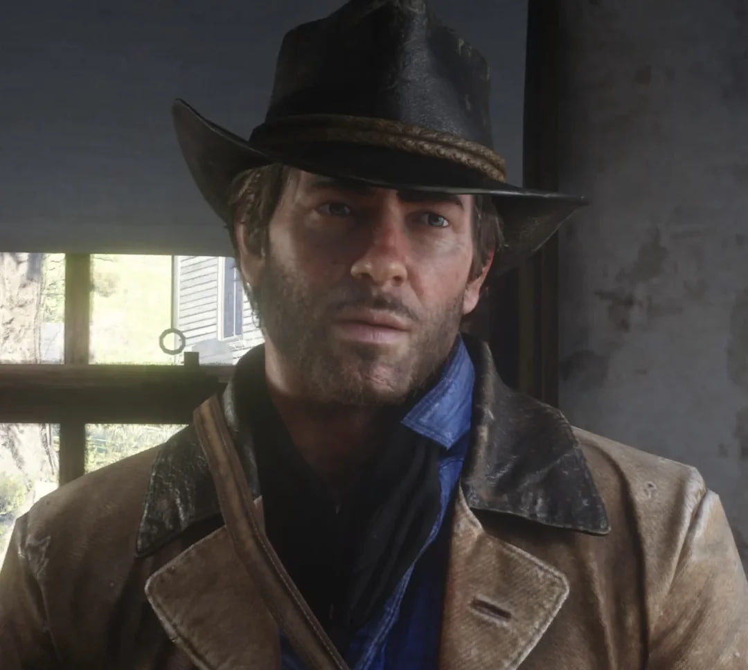
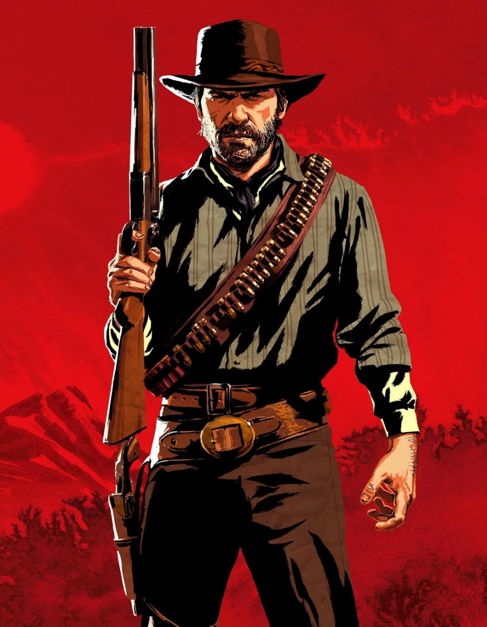
The explanation is more mundane than any theory floating around. Rockstar prepares its painted posters long before release, while character appearances get finalized right at the end of production, so illustrators end up working from beta models. The same thing happened with Michael De Santa in GTA V, and before that with John Marston and Bonnie MacFarlane in the first Red Dead Redemption.
As one commenter pointed out, almost none of the faces in Rockstar artwork match their in-game counterparts exactly – Arthur just happens to be the most extreme case.
Proof of this sits right in the first trailer from October 2016, where the future protagonist appears with a noticeably rougher, more scowling face.
The beta version of Arthur looked meaner and more dangerous than the final one, and the poster pose – tense back, furrowed brow – comes straight from that earlier design. There's also a popular theory that Rockstar didn't scrap the old model entirely but repurposed it: many fans believe the portrait of Lyle Morgan, Arthur's father, actually shows that same early version of Arthur.
A separate line of speculation goes in another direction: in the game, Arthur regularly criticizes his own appearance in mirrors, which some interpret as a leftover trace of the "ugly" prototype.
It's a nice theory, but unnecessary one. Self-deprecation has been baked into the character since chapter one and functions as part of how he sees himself, not some forgotten scrap of old design work. Rockstar illustrations are also deliberately styled like comic book covers and movie posters, so expecting them to match a photorealistic in-game model pixel for pixel misses the point entirely.