UN votes for a new world map Instead of Mercator – it enlarges Africa and shrinks Greenland

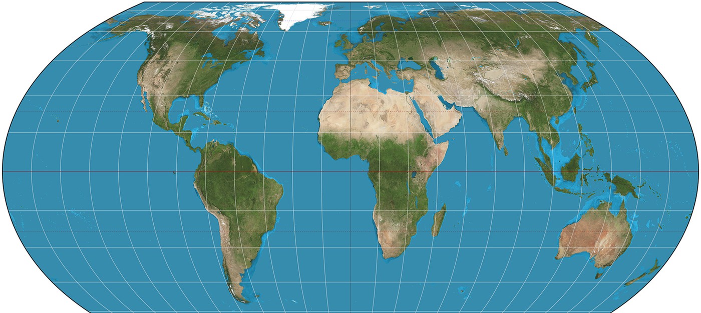
The UN General Assembly has voted to move away from the traditional world map in favor of a projection that more accurately reflects the real size of Africa. The "Correct the Map" resolution, put forward by Togo with backing from African Union member states, secured support from 164 countries, including France and the UK.
The US was the only country to vote against it, while six nations abstained.
Organizers behind the #CorrectTheMap campaign noted:
You could fit the United States, China, India, Japan, Mexico and much of Europe into Africa and still have land to spare.
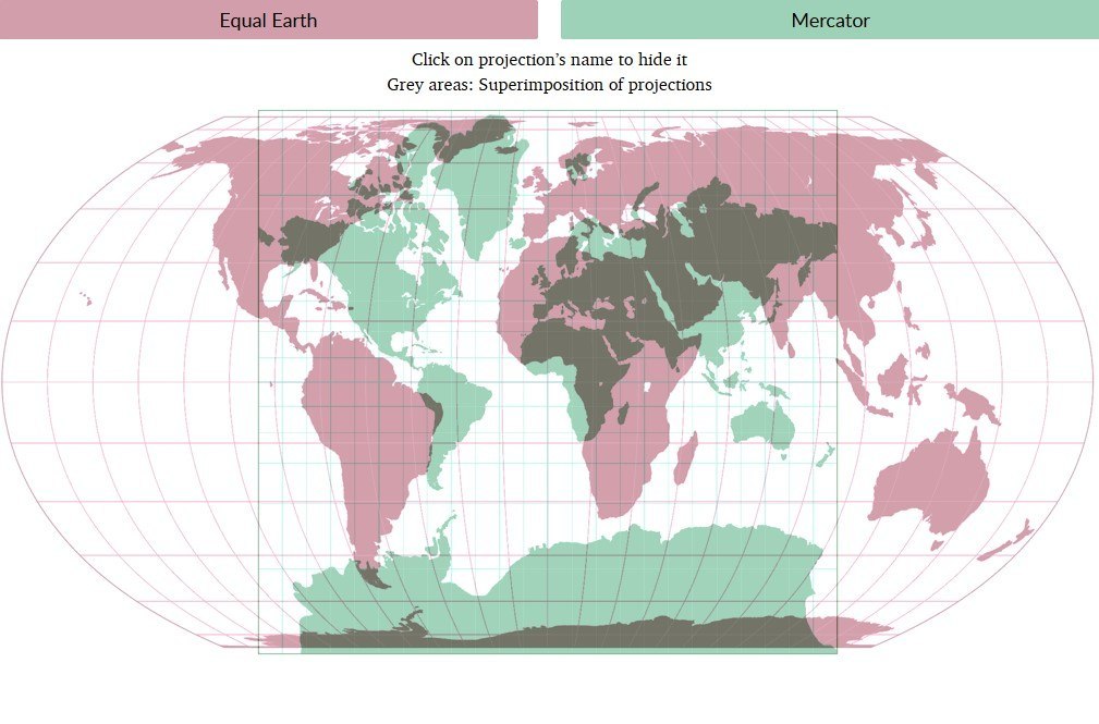
The UN vote carries no binding force, but it could still lead to changes in the maps used by institutions worldwide. The Mercator projection, in use since the 16th century, has long drawn criticism for distorting proportions – on it, Africa looks roughly the same size as Greenland, even though it's actually about 14 times larger. Critics argue that this distortion downplays the development potential and needs of countries located near the equator.
Flemish cartographer Gerardus Mercator designed the projection in 1569 to help European explorers navigate the globe. The distortions stem from a basic problem: there's no way to transfer the surface of a sphere onto a flat map without losing accuracy somewhere, so every world projection involves tradeoffs.
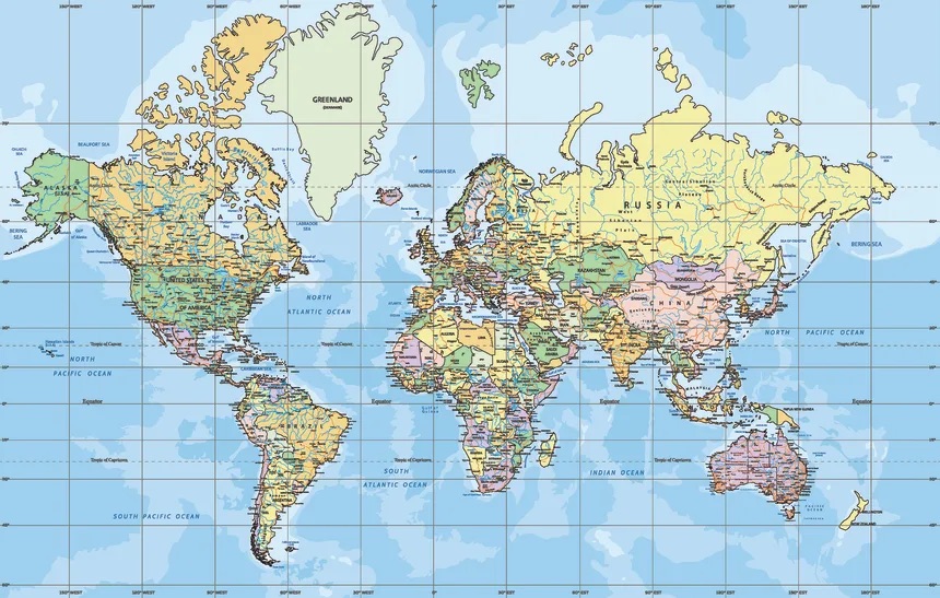
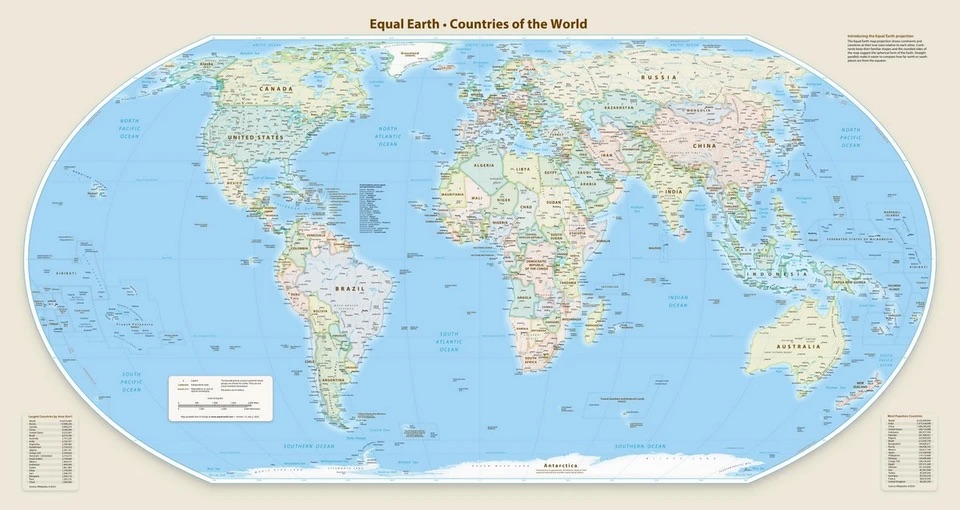
The Mercator projection compensates for the curvature of the Earth by shrinking countries near the equator below their true size, while countries near the poles appear larger than they really are. To fix this imbalance, a team of cartographers created an equal-area projection called Equal Earth back in 2018. In February, all 54 African Union member states officially adopted it, stating that it "more accurately represents the sizes of all continents, particularly Africa."
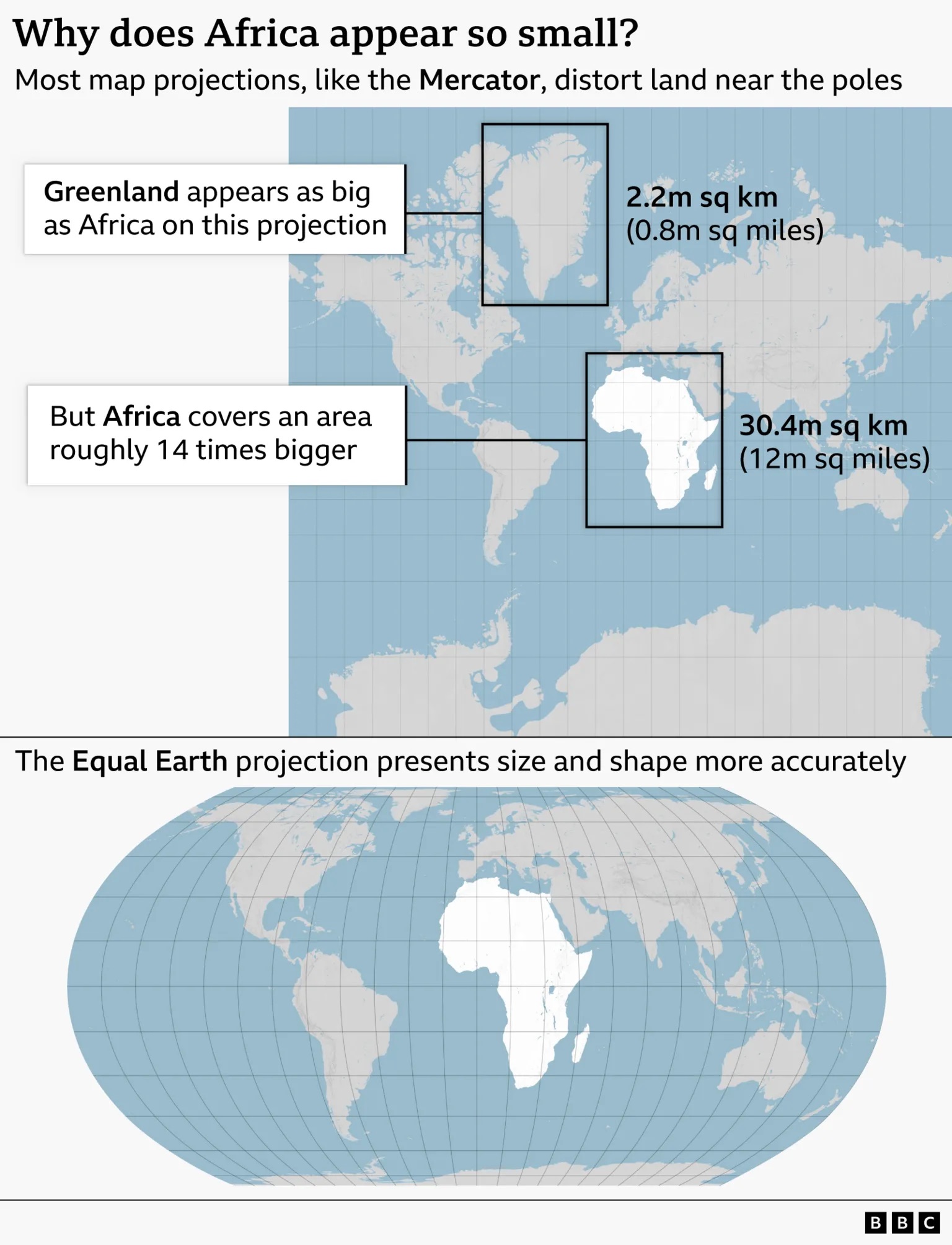
The difference between the two projections becomes obvious once you compare them side by side. On the Mercator map, Greenland, which covers about 2.2 million square kilometers, appears comparable in size to Africa, which spans roughly 30.4 million square kilometers – about 14 times larger. On the Equal Earth projection, the relative sizes of continents come through far more accurately, and Africa appears noticeably bigger than Greenland.
Africa's misrepresentation on world maps is not just a cartographic error - it's a narrative issue
Lerato Mogoatlhe from Africa No Filter
Kenyan geographer Kioko Muendo believes the Mercator projection has implicitly downplayed the African continent's vast resources, population and investment opportunities.
Maps are more than just guides for travellers - they shape how regions are perceived politically and economically.
French Foreign Minister Jean-Noël Barrot said the country will drop Mercator maps in favor of "cartographic projections adapted for specific purposes, more accurately reflecting real surface areas and in line with the recommendations of cartographers and scientists."