Marathon players are frustrated with the UI and want Bungie to simplify it fast
Things move fast in the games industry. Just a few months after Marathon was delayed indefinitely, Bungie is already running server slam test weekends ahead of the March 23 launch. Hundreds of thousands of players have jumped into the new extraction shooter, and first impressions have been broadly positive – though one element has drawn a wave of criticism.
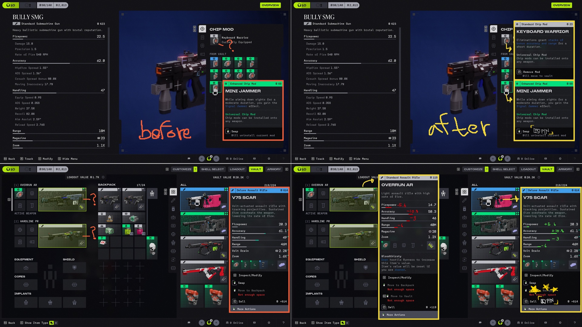
That element is the UI. The Marathon interface is cluttered – multiple font sizes, clashing colors, several typographic styles competing for attention at once. It's gotten bad enough that one content creator coined the term "Fontslop" – riffing on the already-established "AI slop" and similar terms used to describe lazy or algorithmically generated garbage.
One player wrote:
"UI is my biggest letdown. I can get used to the heavy movement and a lot of other things, but the UI and HUD are too small and confusing. I'm already just picking default gear sets to avoid dealing with it, when I'd actually like to learn the system properly. Don't think the game is for me. Art is cool though."
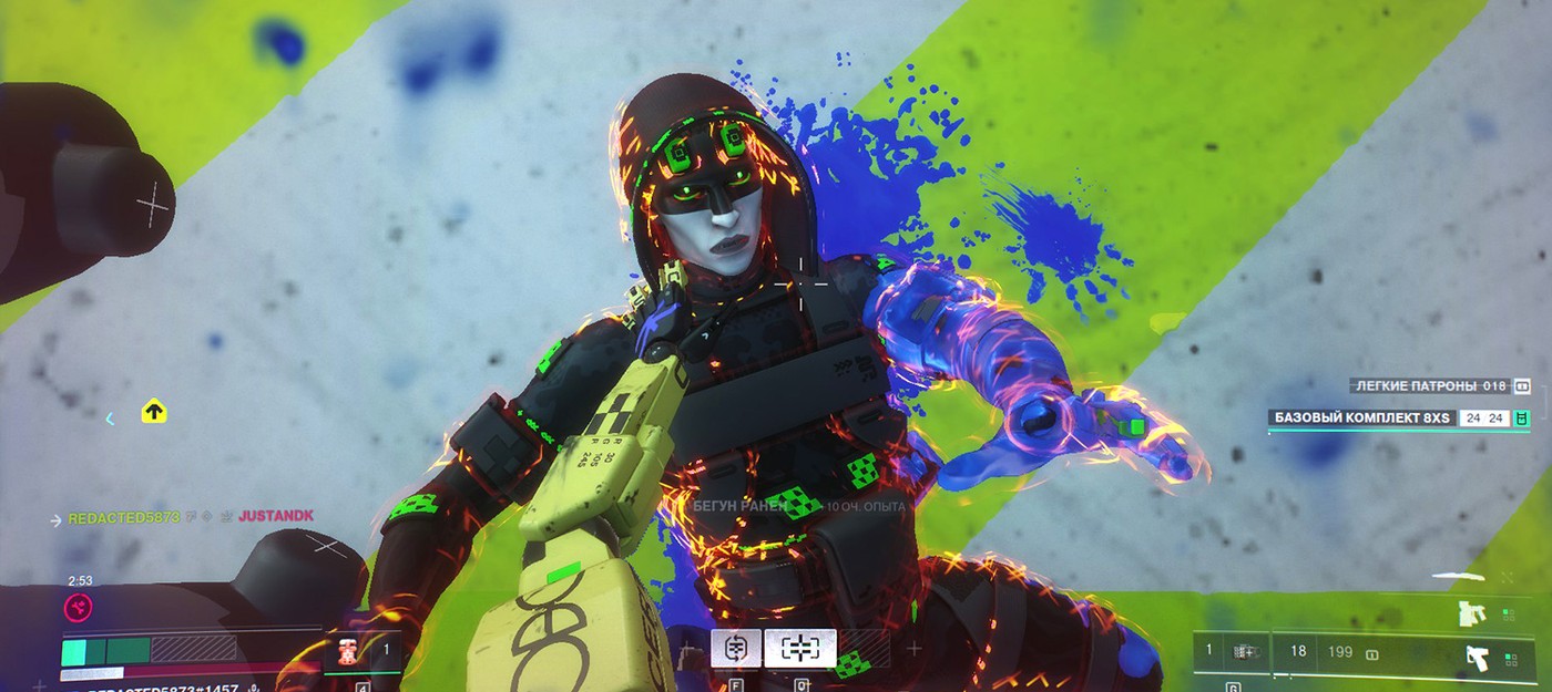
Here's what they mean:
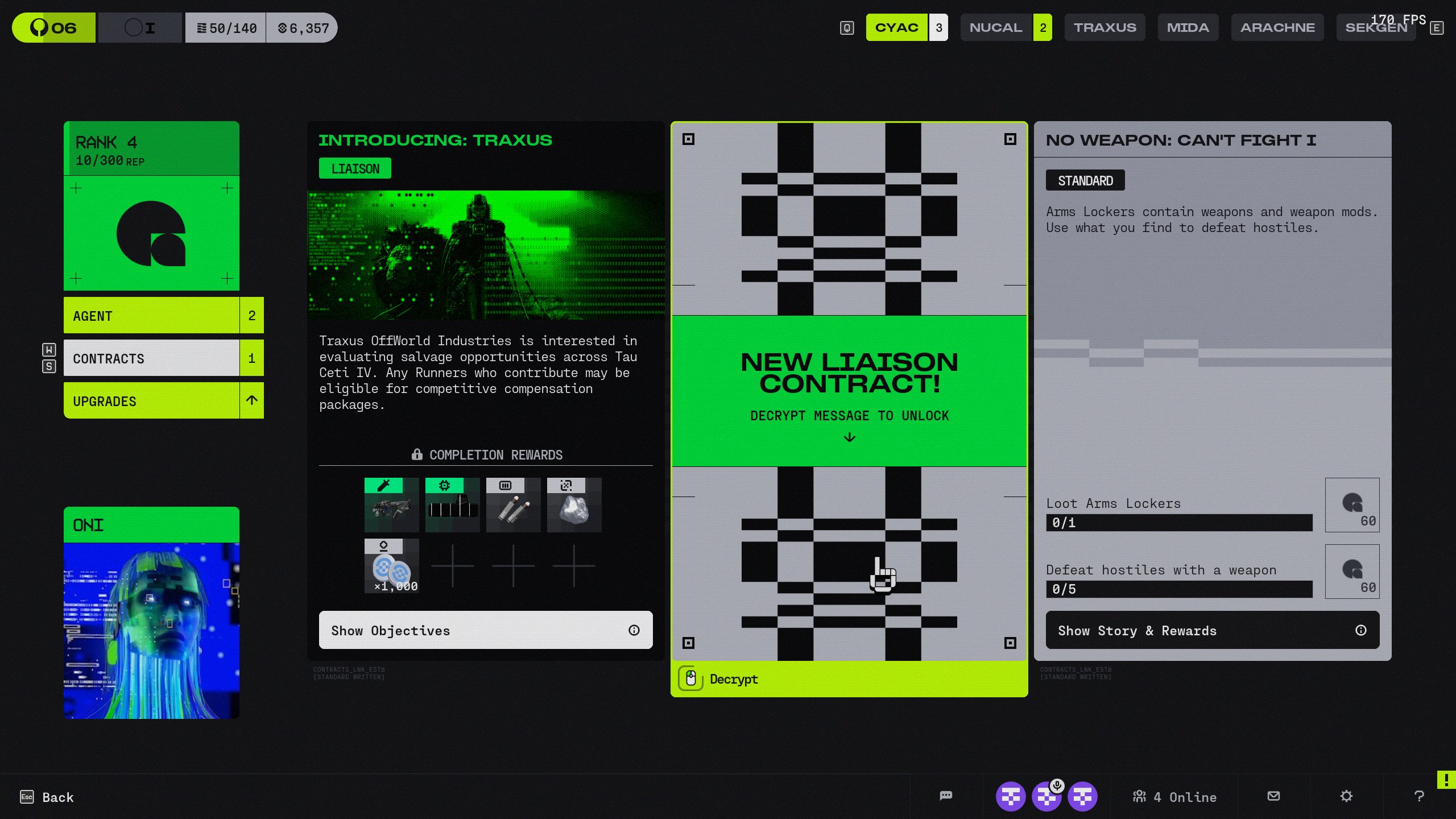
The criticism lands – looking at that screenshot, it's genuinely hard to tell what's going on.
Another player added:
"The UI is genuinely bad at communicating information."
Whether these complaints are enough to push Bungie into making changes before launch – and whether there's even time for that – remains an open question.
That said, the UI criticism hasn't stopped Marathon from making a real splash. The Steam peak has already crossed 143,000 concurrent players. That's a long way from ARC Raiders' 481,966, but it's far from a failure. For context: Concord peaked at 697 players on Steam, and Highguard hit 97,249 – with most of them leaving within minutes.