Amplitude Studios reveals major UI overhaul for Endless Legend 2 Early Access
Amplitude Studios shared detailed plans for a comprehensive UI/UX redesign in Endless Legend 2, addressing widespread player feedback about the game's current interface being scattered and difficult to navigate.
Game Director Derek Paxton outlined the studio's approach in a recent dev blog, revealing concept designs that consolidate information and streamline player interaction with core game systems.
The redesign tackles what Paxton calls the "Divided UI" concept, where information and actions were split across different parts of the screen based on internal logic that didn't align with player expectations. Paxton explained:
We split information on different sides of the screen because there was a logical difference (for us) or we wanted to minimize overlap on the center of the screen. But it ended up being frustrating for players that didn't know what part of the screen to look at to find information or actions.
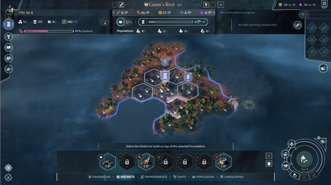
Before
After
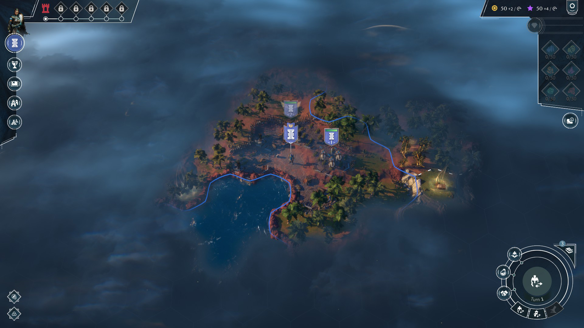
The main screen currently displays empire actions in two separate locations – some in the upper left, including protectorates, empire overview, and quest log, while others cluster around the turn button, such as heroes, research, and diplomacy. The studio outlined four specific changes to address this fragmentation:
All empire actions consolidated in the upper left
Faction powers moved to the top center for improved visibility
Strategic resources redesigned to take up less space
Research per turn now clearly displayed
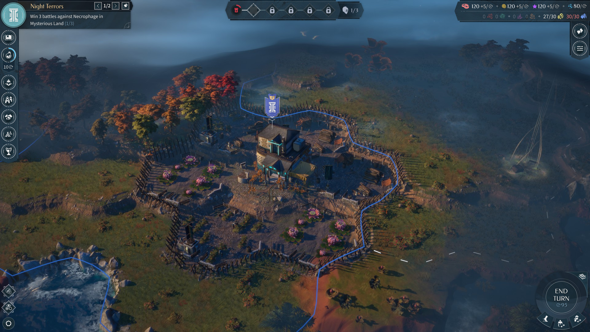
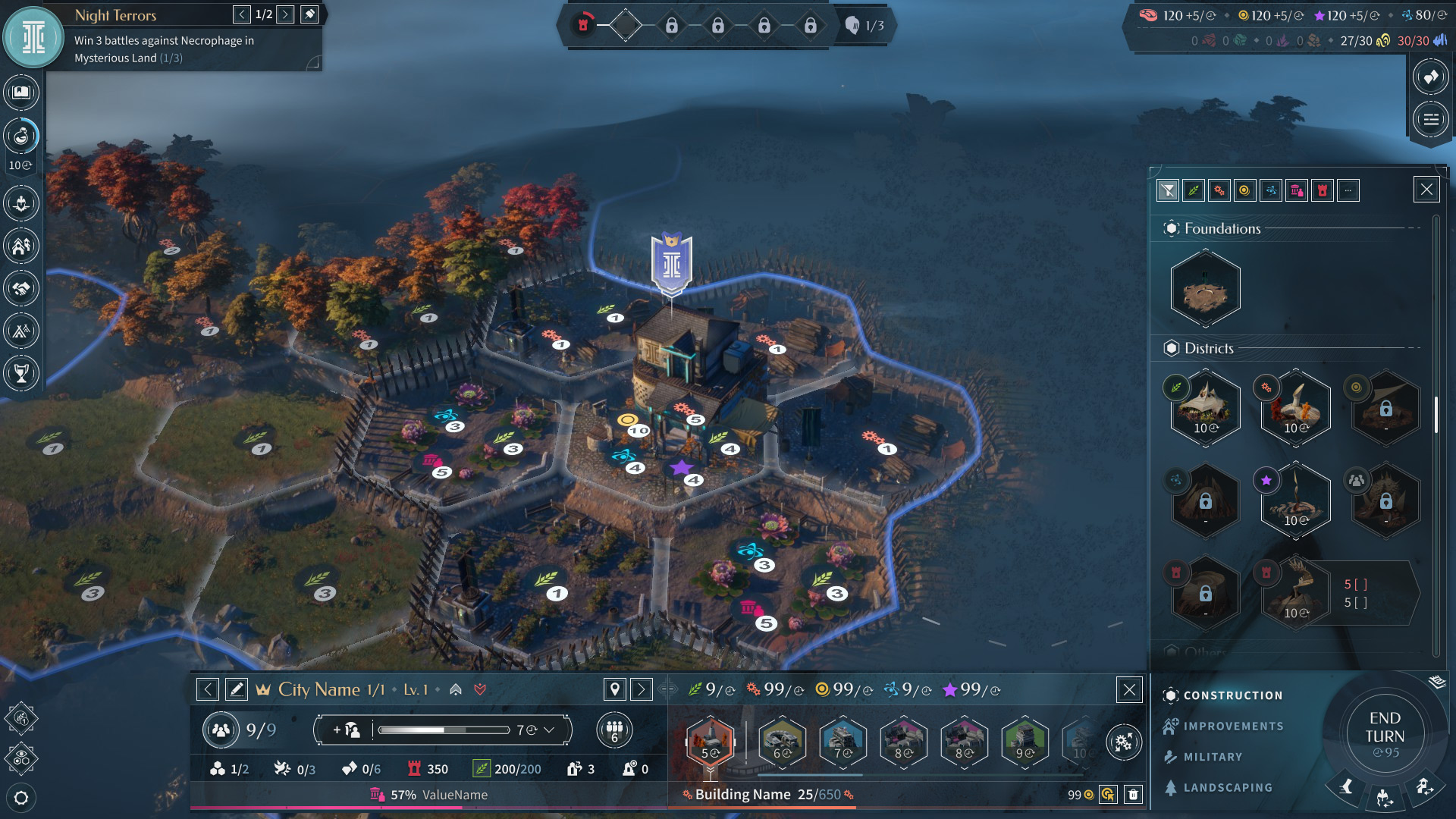
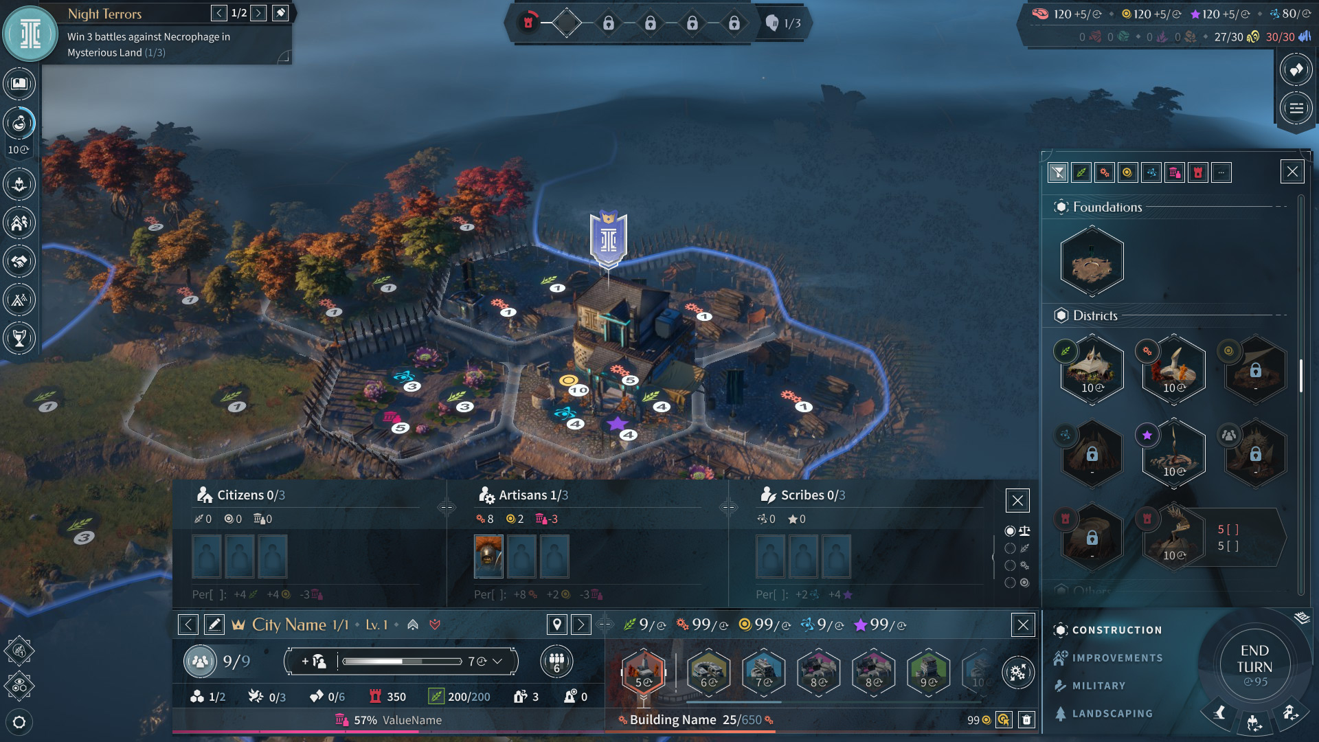
City management receives even more extensive changes. The current system requires players to click a tile in the world before selecting a district type, inverting the natural decision-making process. Paxton noted this addresses confusion around adjacency bonuses, district leveling, population management, and construction decisions.
The studio defined five core goals for the city interface redesign:
Move all city information to the bottom of the screen
Switch district construction to list-based selection, allowing players to pick the district first and then choose placement
Enable filtering for districts and improvements lists
Allow population and construction menus to remain open simultaneously
Display already constructed improvements – a feature currently absent that community members identified as critical for tracking conditional upgrades
Before
After
Amplitude Community Manager Daakarrow confirmed the studio began this work during the Insiders program and expanded it after the demo based on community feedback. The team emphasized the complexity of implementing these changes, which involve not just moving UI elements but fundamentally altering information flow and adapting everything for Steam Deck's unique layout requirements.
Derek Paxton stressed the importance of sharing concepts early.
It's a lot of work even if it seems simple. Which is why it's so important to us that we start sharing it all with you so that you can see the direction and we can get as much input as possible.
Community response has been overwhelmingly positive, with players praising the consolidation of information and the switch to list-based district construction. Multiple users noted the current UI was their primary barrier to purchasing the early access version. The studio indicated these changes won't arrive for several weeks as implementation continues.