Civilization 7 players are still struggling with its unreadable UI almost a year after launch
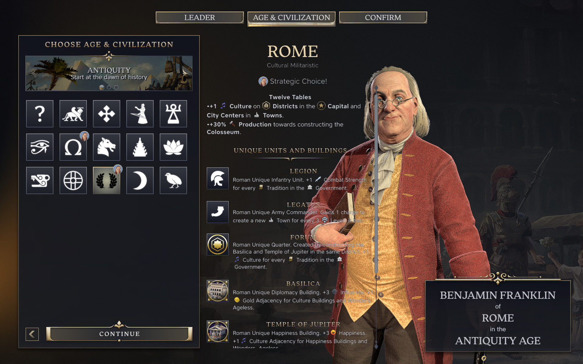
Nearly a year after launch, Sid Meier's Civilization 7 players are still pointing out UI issues that have yet to be addressed. The latest wave of complaints was sparked by a screenshot of the leader selection screen, where Benjamin Franklin's portrait sits directly behind the description text – no darkening, minimal contrast, barely readable.
Commenters noted that the layout looks like it was designed for ultrawide 21:9 monitors, where the character portrait sits far enough from the text to not interfere. On standard 16:9 screens – still the default for the vast majority of players – the result is genuinely hard to read.
UI complaints have followed Civilization 7 since its February 2025 launch, when the game landed on "Mixed" reviews on Steam with only 44% positive ratings. Firaxis acknowledged the issues within days and declared UI improvements would be "priority number one." Several updates have since rolled out, the overall score has climbed considerably, and both the interface and AI have seen improvements – but the core readability problems remain.
Beyond aesthetics, players are also pointing to systemic issues: when selecting a civilization before starting a game, its unique traditions and policies – key factors for making an informed choice – are nowhere to be found on the selection screen. That information only appears on the loading screen, after the decision has already been made.
Some issues can be partially addressed through mods – for instance, the Improved Plot Tooltip mod adds detailed tile tooltips. But overall readability and UI comfort are still a source of significant frustration, especially coming from Civ 6, where each district had its own color-coding system.
Hopefully, the major spring update will bring some UI fixes alongside the option to stick with a single civilization throughout an entire game.