Marathon UI designer promises the "sauce" isn't going anywhere
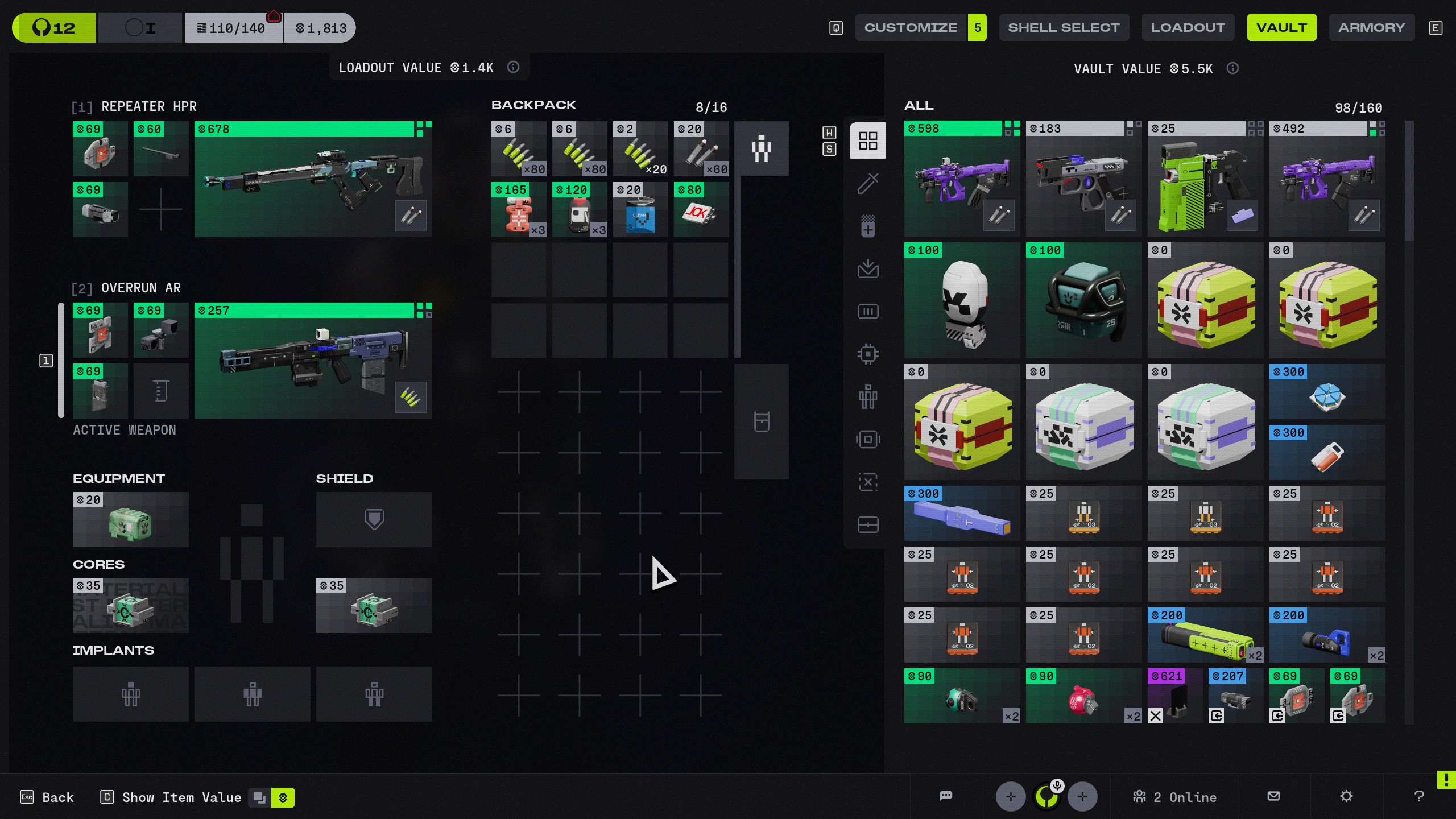
One of the biggest talking points after the Marathon server slam wasn't gameplay or balance – it was the menu design. Last week, a YouTuber looked at the UI and solemnly declared it the first-ever "fontslop" game, meaning a game with illegible, overloaded typography. The clip spread fast and found plenty of sympathizers.
The reaction was loud enough for Bungie to notice. The studio's official X account openly invited players to keep sharing their thoughts: "Keep it coming." But anyone hoping for a full visual overhaul should probably temper their expectations.
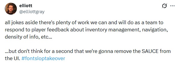
Elliott Gray, a UI designer at Bungie who proudly describes himself as a "fontslop merchant" in his X bio, made clear that the signature aesthetic of Marathon isn't going anywhere. "Don't think for a second that we're gonna remove the SAUCE from the UI," Gray wrote on X, capping the post with a #fontsloptakeover hashtag.
He did add that the team is taking the criticism seriously:
"All jokes aside, there's plenty of work we can and will do as a team to respond to player feedback about inventory management, navigation, density of info, etc."
That style – angular fonts, dense layouts, unconventional icons, a kind of gritty linuxcore industrial look – is very much a deliberate choice. The practical complaints are real: inventory sorting icons are too similar to each other, tracking items is a pain, and navigating the Codex takes more clicks than it should.
Those are legitimate problems Bungie intends to fix. The visual identity of the UI, though, appears set to stay intact.
The more extreme reactions to Marathon's style can largely be explained by over a decade of big-budget multiplayer shooters defaulting to the most neutral, standardized UI design possible. Anything that isn't immediately readable gets labeled a flaw. Any visual density gets called overwhelming.
Against that backdrop, the distinct look of Marathon reads as provocative – which is probably exactly what makes it memorable.
- Marathon players slam the battle pass as the "worst value for your money" and say Bungie never learns
- Peaceful lobbies exist in Marathon after all – a whole map extracted together and nobody got shot
- Marathon players found a way to fly across the map by hooking onto their own drone